Redesigning candidate card
For an applicant tracking system
Redesigning candidate card
For an applicant tracking system
Redesigning candidate card
For an applicant tracking system
Brief
Brief
Brief
Revamp the current candidate listing page for jobs to incorporate additional data on the candidate cards as specified by the product team. This enhancement should facilitate recruiters' workflow and enhance the overall user experience.
Revamp the current candidate listing page for jobs to incorporate additional data on the candidate cards as specified by the product team. This enhancement should facilitate recruiters' workflow and enhance the overall user experience.
Revamp the current candidate listing page for jobs to incorporate additional data on the candidate cards as specified by the product team. This enhancement should facilitate recruiters' workflow and enhance the overall user experience.
Requirement
Requirement
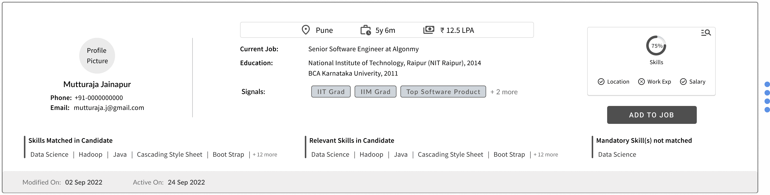
The product team specified that the candidate card should have
Name
Contact details
Location, Work Experience etc.
Skill match%
Designation match%
Skills matched
Signal
Open CV in another tab
Source & its validity
The product team specified that the candidate card should have
Name
Contact details
Location, Work Experience etc.
Skill match%
Designation match%
Skills matched
Signal
Open CV in another tab
Source & its validity
The product team specified that the candidate card should have
Name
Contact details
Location, Work Experience etc.
Skill match%
Designation match%
Skills matched
Signal
Open CV in another tab
Source & its validity
Study of Existing Portal
Study of Existing Portal
Study of Existing Portal
Duplication of information
Inconsistency in page name & breadcrumb
Non intuitive actionable component
Duplicate action
Non intuitive action icon opening applicant view page in new tab
Non-actionable icons
Action icons are not intuitive. For example, ‘eye’ icon opens CV in a popup, and the ‘download’ icon downloads the CV.

Inconsistency in selection colour.
Information on card is not relevant as per the stage and user.
View CV and download cv is not relevant and also misleading.
Icon is put to represent interviewer and is not actionable. This is non relevant and inconsistent use of icon.
Inconsistency in selection colour.
Information on card is not relevant as per the stage and user.
View CV and download cv is not relevant and also misleading.
Icon is put to represent interviewer and is not actionable. This is non relevant and inconsistent use of icon.
All the candidate card has same information irrespective of their states in the job. Interviewer also has the visibility of same information as the recruiter.
All the candidate card has same information irrespective of their states in the job. Interviewer also has the visibility of same information as the recruiter.
All the candidate card has same information irrespective of their states in the job. Interviewer also has the visibility of same information as the recruiter.
Secondary Research
Secondary Research
Secondary research was conducted on candidate listing page & details that are present on different candidate cards.
Secondary research was conducted on candidate listing page & details that are present on different candidate cards.
Secondary research was conducted on candidate listing page & details that are present on different candidate cards.
Secondary Research
Ideation & lo-fi design
Ideation & lo-fi design
Ideation & lo-fi design
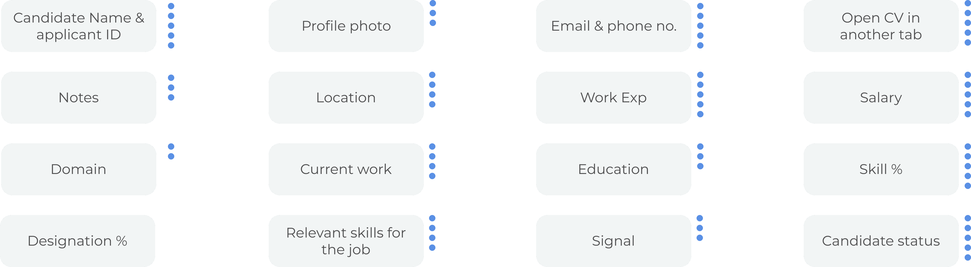
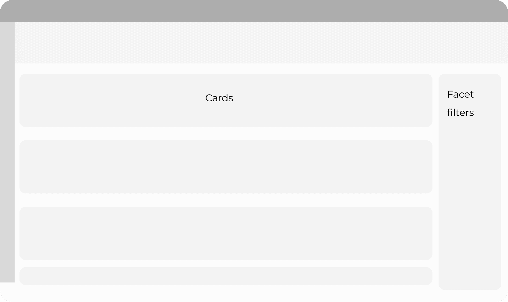
Card Details
Card Details
In a workshop with two product managers, three customer success manager, card sorting was done. To get an understanding if the requirement for the card design is relevant to recruiter or not. regrading all the details that were added in candidate card. Their votes are shown in blue dots besides each item.
In a workshop with two product managers, three customer success manager, card sorting was done. To get an understanding if the requirement for the card design is relevant to recruiter or not. regrading all the details that were added in candidate card. Their votes are shown in blue dots besides each item.
In a workshop with two product managers, three customer success manager, card sorting was done. To get an understanding if the requirement for the card design is relevant to recruiter or not. regrading all the details that were added in candidate card. Their votes are shown in blue dots besides each item.
Lo-fi design was internally assessed within the design and product team.
Lo-fi design was internally assessed within the design and product team.
Lo-fi design was internally assessed within the design and product team.


Page layout
Page layout
All the details to be put into card was throughly checked and questioned with multiple alternative design and rationale behind these iterations
All the details to be put into card was throughly checked and questioned with multiple alternative design and rationale behind these iterations
All the details to be put into card was throughly checked and questioned with multiple alternative design and rationale behind these iterations
Static Filter
Static Filter
Static Filter
Pros
Pros
i) Constant view of available filters
ii) Allows user to play around with filters to see result sets
i) Constant view of available filters
ii) Allows user to play around with filters to see result sets
i) Constant view of available filters
ii) Allows user to play around with filters to see result sets
i) Constant view of available filters
ii) Allows user to play around with filters to see result sets
Cons
Cons
i) Filters constantly occupy real estate
ii) Filter triggers need to be fast for such filters
iii) Effective only if the user makes parallel changes
iv) The height of the filters might remain long if the page content is low
i) Filters constantly occupy real estate
ii) Filter triggers need to be fast for such filters
iii) Effective only if the user makes parallel changes
iv) The height of the filters might remain long if the page content is low
i) Filters constantly occupy real estate
ii) Filter triggers need to be fast for such filters
iii) Effective only if the user makes parallel changes
iv) The height of the filters might remain long if the page content is low
i) Filters constantly occupy real estate
ii) Filter triggers need to be fast for such filters
iii) Effective only if the user makes parallel changes
iv) The height of the filters might remain long if the page content is low.
Overlay Filter
Overlay Filter
Overlay Filter
Pros
Pros
i) Highly suitable for B2B use case, as the user sets filter criteria and goes through the candidates/applies list before he chooses to change the criteria again.
ii) Would be consistent with mobile filters where static space can’t be occupied
i) Highly suitable for B2B use case, as the user sets filter criteria and goes through the candidates/applies list before he chooses to change the criteria again.
ii) Would be consistent with mobile filters where static space can’t be occupied
i) Highly suitable for B2B use case, as the user sets filter criteria and goes through the candidates/applies list before he chooses to change the criteria again.
ii) Would be consistent with mobile filters where static space can’t be occupied
i) Highly suitable for B2B use case, as the user sets filter criteria and goes through the candidates/applies list before he chooses to change the criteria again.
ii) Would be consistent with mobile filters where static space can’t be occupied
Cons
Cons
i) No context of available filters unless opened
ii) Effective only when its a batch filtering
iii) 1 click to open filters + 1 extra click to apply them
i) No context of available filters unless opened
ii) Effective only when its a batch filtering
iii) 1 click to open filters + 1 extra click to apply them
i) No context of available filters unless opened
ii) Effective only when its a batch filtering
iii) 1 click to open filters + 1 extra click to apply them
i) No context of available filters unless opened
ii) Effective only when its a batch filtering
iii) 1 click to open filters + 1 extra click to apply them
Pipeline View in top right
Pipeline View in top right
Pipeline View in top right
Pros
Pros
Pipeline consistent with job card.
Easy view of job health.
Pipeline consistent with job card.
Easy view of job health.
Cons
Cons
Not intuitive navigation at the right side of the page
Not intuitive navigation at the right side of the page
Pipeline View in left
Pipeline View in left
Pipeline View in left
Pros
Pros
Intuitive navigation with tab view
Intuitive navigation with tab view
Cons
Cons
More vertical space occupied.
More vertical space occupied.
Quick Filter
Quick Filter
Quick Filter
Quick Filter
The most used filter is to be kept as a quick filter, which will help users to work more efficiently, as many of the current users are unable to find the required filter quickly.
The most used filter is to be kept as a quick filter, which will help users to work more efficiently, as many of the current users are unable to find the required filter quickly.
The most used filter is to be kept as a quick filter, which will help users to work more efficiently, as many of the current users are unable to find the required filter quickly.

Pipeline View with stages upfront
Pipeline View with stages upfront
Pipeline View with stages upfront
Pros
Pros
The pipeline view shows how many are at which stage upfront.
The pipeline view shows how many are at which stage upfront.
Cons
Cons
Occupies more real estate vertically.
Make navigation little more complex.
Occupies more real estate vertically.
Make navigation little more complex.

Colour & Typography
Colour & Typography
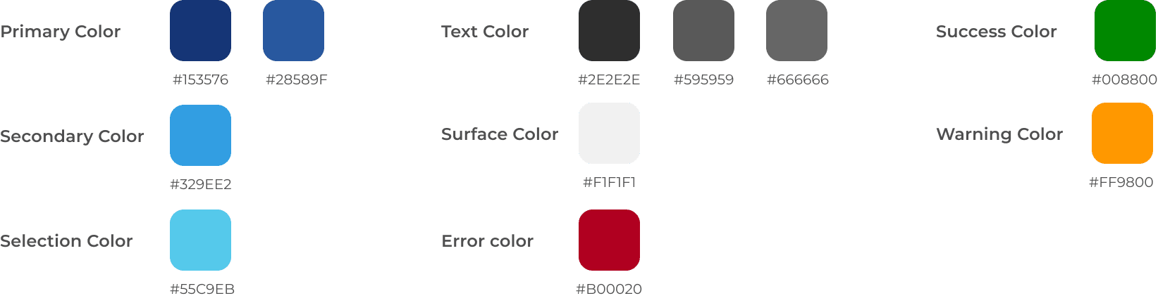

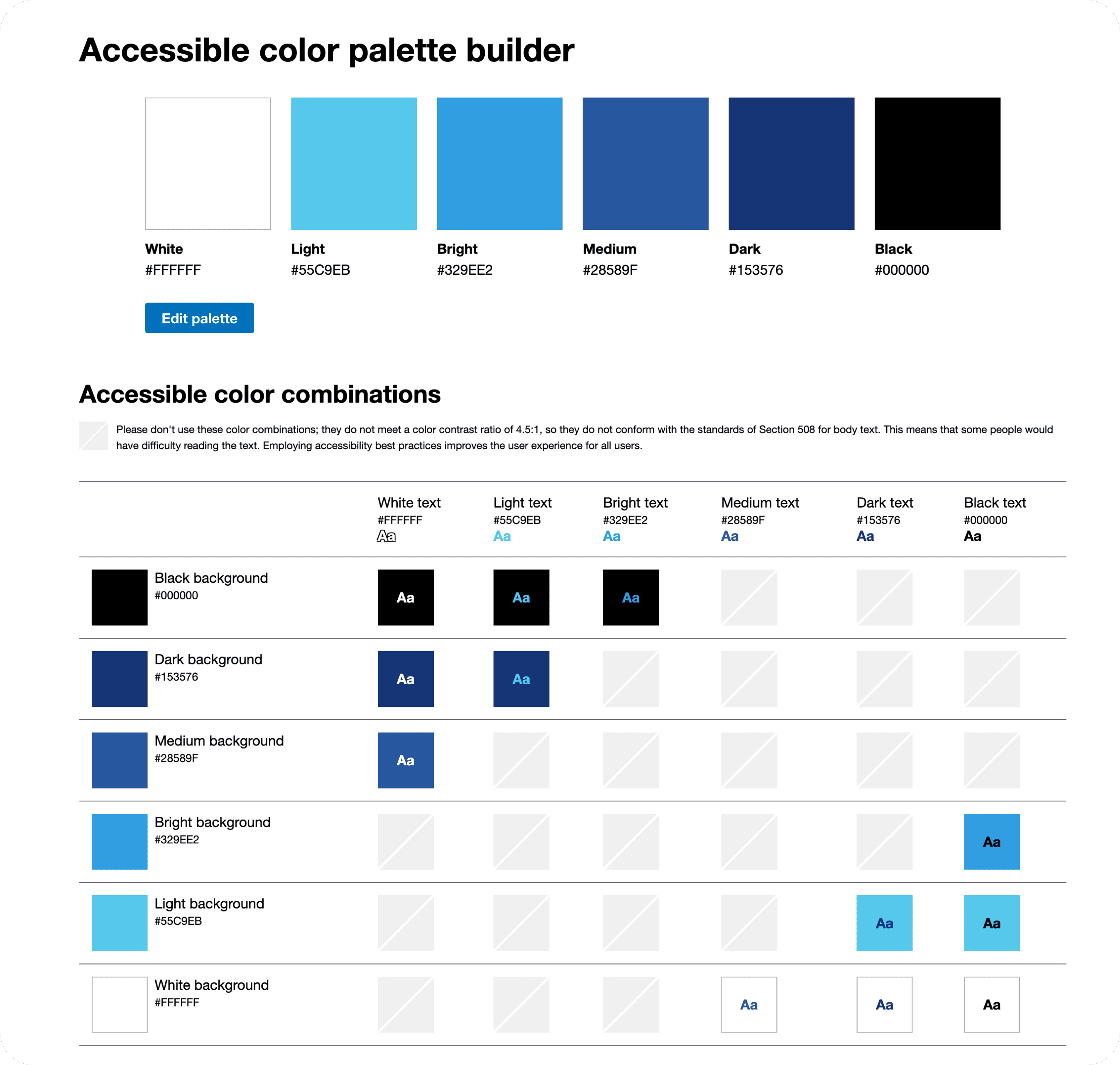
All the colors used are AAA accessible.
All the colors used are AAA accessible.
All the colors used are AAA accessible.
Colour & Typography
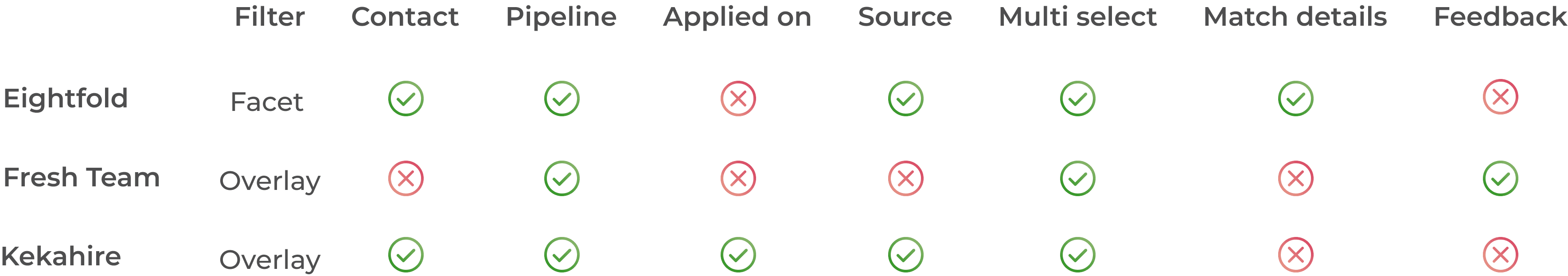
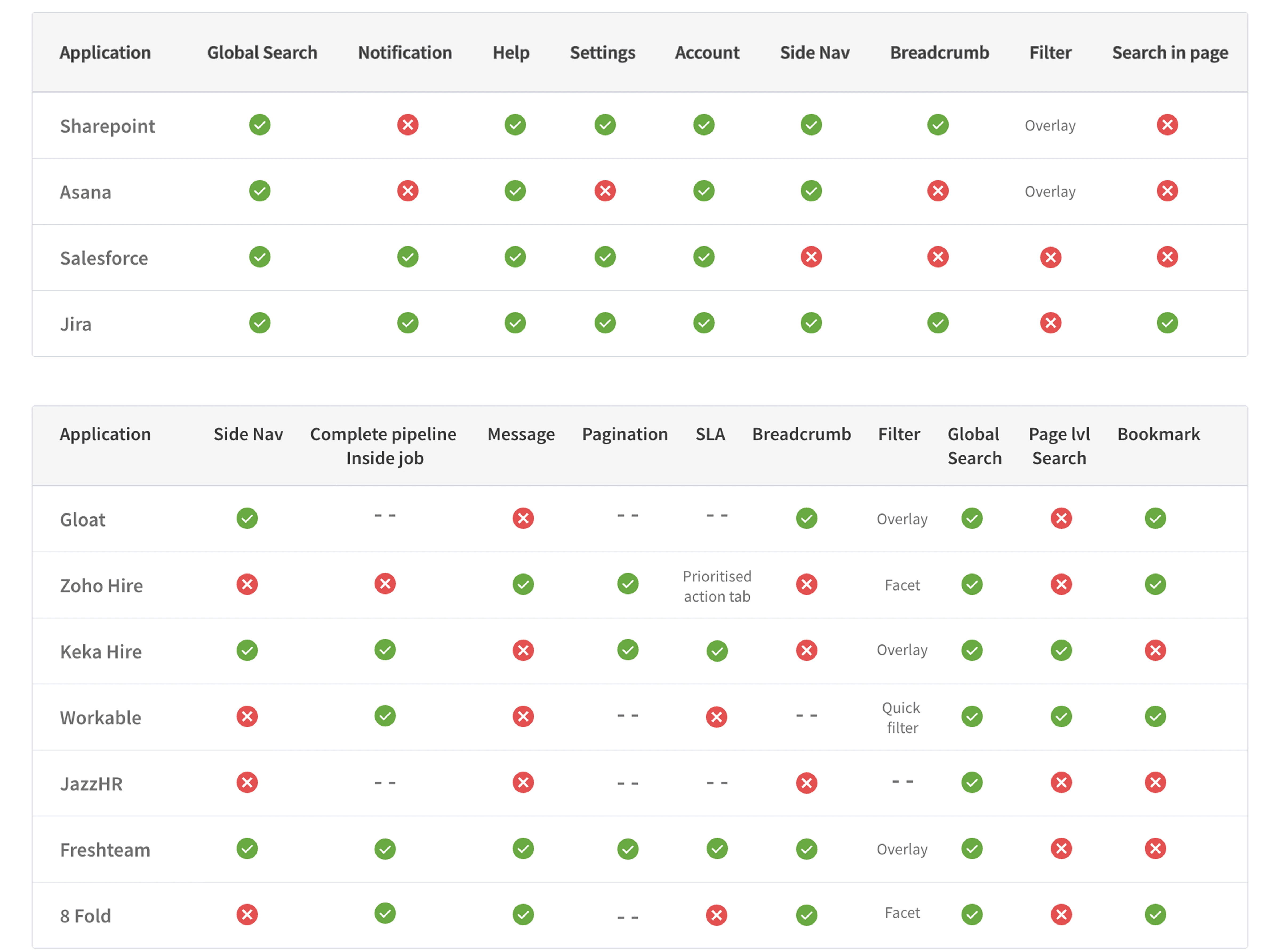
Secondary Research for components
Secondary Research for components
Secondary Research for components

Hi-Fidelity Design
Hi-Fidelity Design
Hi-Fidelity Design
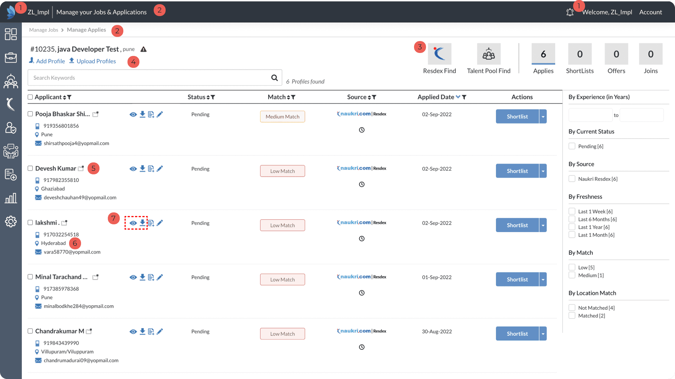
Existing Design
Existing Design
Duplication of information
Inconsistency in page name & breadcrumb
Non intuitive actionable component
Duplicate action
Non intuitive action icon opening applicant view page in new tab
Non-actionable icons
Action icons are not intuitive. For example, ‘eye’ icon opens CV in a popup, and the ‘download’ icon downloads the CV.
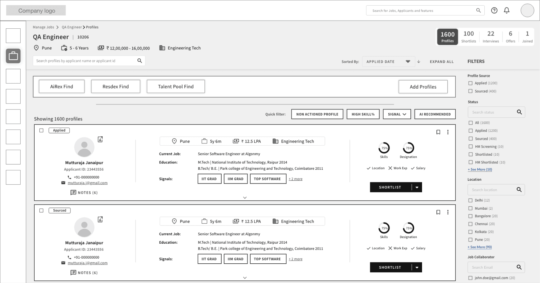
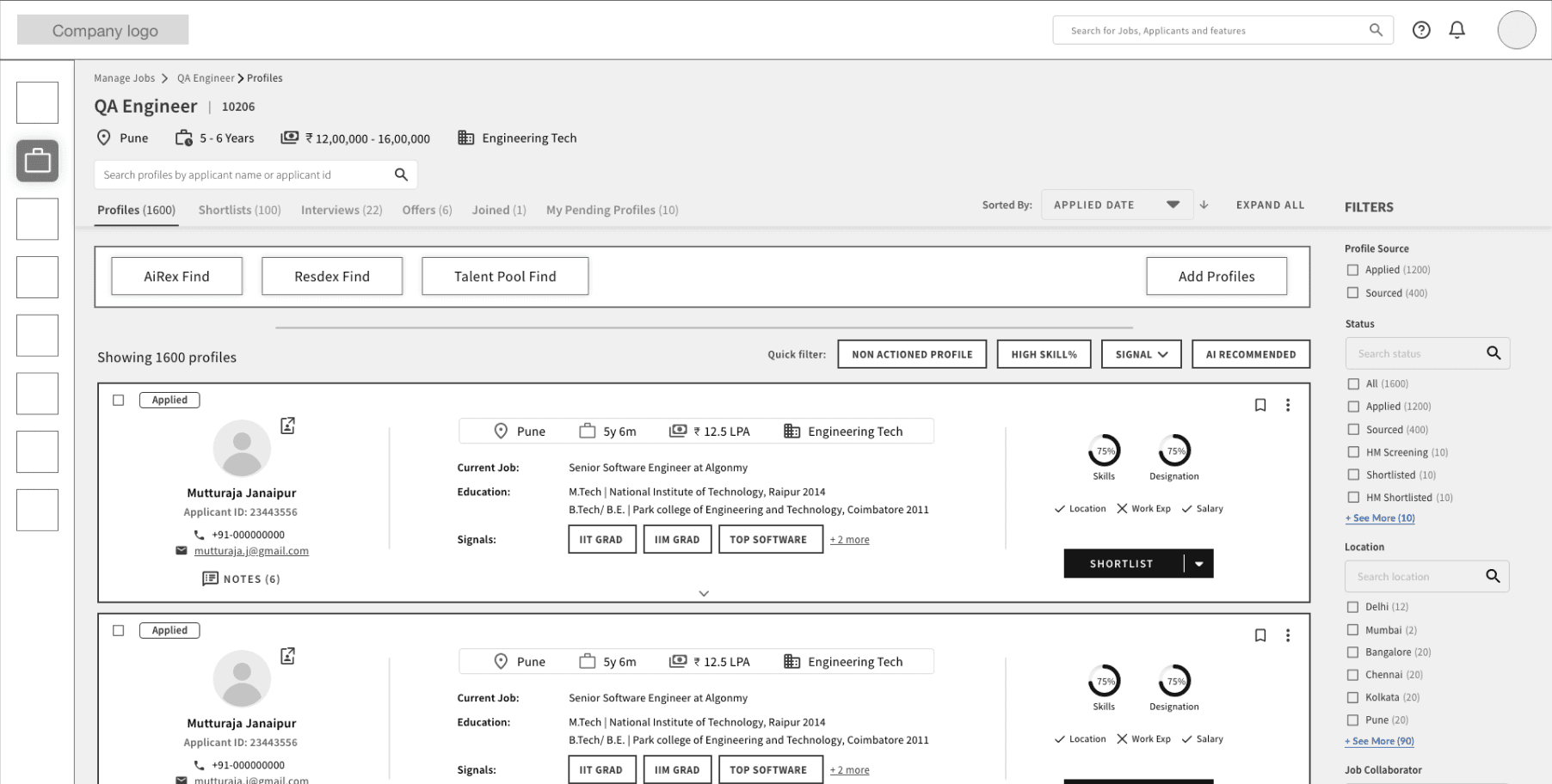
Proposed Design
Proposed Design
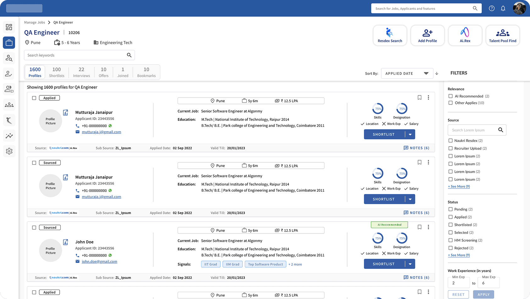
Resolved inconsistency between page name & breadcrumb.
Resolved issues between actionable and non actionable component.
Relevant data for the user added as per feasibility.
Informations are organized as per their priority.
Resolved inconsistency between page name & breadcrumb.
Resolved issues between actionable and non actionable component.
Relevant data for the user added as per feasibility.
Informations are organized as per their priority.
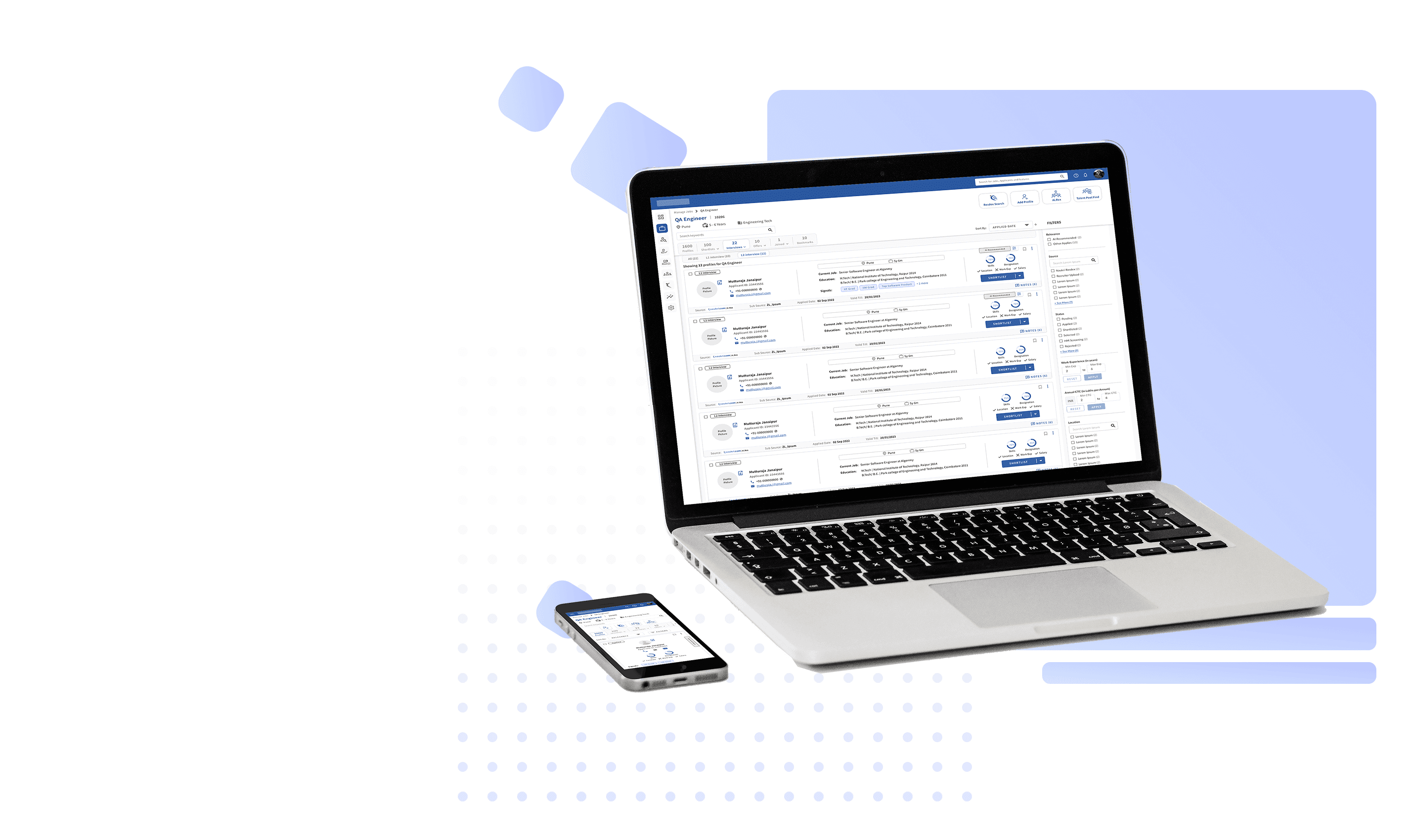
Final Design
Final Design
Final Design
Customer Feedback
Customer Feedback
The candidate's status in the job needs to be more vibrant and prominent.
The ‘View CV’ option is an important feature for the recruiters and should be made very prominent to the user.
The candidate's status in the job needs to be more vibrant and prominent.
The ‘View CV’ option is an important feature for the recruiters and should be made very prominent to the user.
The candidate's status in the job needs to be more vibrant and prominent.
The ‘View CV’ option is an important feature for the recruiters and should be made very prominent to the user.
After incorporating feedback
After incorporating feedback
